We came, we saw, we coloured everything.
The phrase captures the transformation Gwillimdale has undergone over the past two years, an evolution that began with a refreshed brand identity and has now burst into full colour with the launch of Arterra™ rainbow carrots. For Marketing and Brand Manager Kshama Joshi and Senior Sales & Plant Operations Manager Quinton Woods, this journey has been as much about internal alignment as it has been about external innovation.
Kshama describes the rebrand as a turning point: “It gave us a stronger, clearer sense of who we are and what we want to bring to market. Every idea since, whether packaging, product development, or storytelling, has been guided by that purpose of delivering quality, freshness, and trust in a modern, meaningful way.”
Quinton adds that the rebrand didn’t just reshape the look of the company, it reshaped how teams work together. “We’re aligned on what the Gwillimdale brand stands for. Innovation now feels intentional and consumer‑driven. We’re not just launching products; we’re launching experiences that reflect our values.”
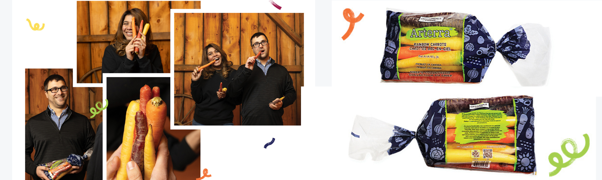
That shared vision set the stage for Arterra™ a name that blends art with terra, the Latin word for earth. The result is a product that embodies creativity, authenticity, and a deep respect for nature.
“Each colour has its own flavour, nutritional profile, and personality,” Kshama explains. “We worked closely with growers who share our standards to ensure consistency in every bag. Arterra is a true expression of our brand brought to life through colour.”
The rainbow carrots symbolize the vibrancy now woven through Gwillimdale’s culture, packaging, and product line. They also challenge the idea that “fresh” must be limited to earthy greens and browns. Nature, after all, produces its own spectrum, brilliant reds, golden yellows, deep purples, and everything in between.
As Gwillimdale prepares for the Canadian Produce Marketing Association’s (CPMA) Convention and Trade Show, the team is eager to showcase this next chapter. “Our booth will reflect our evolution, fresh, colourful, and full of creativity,” says Kshama. “It’s the first time many of our new packaging designs and Arterra will be on display.”
Quinton notes that the company’s momentum extends beyond this launch. “We’re continuing to diversify our offerings and invest in initiatives that support education and community engagement. Our vision remains the same: to keep growing better for consumers, partners, and our brand.”
Arterra, he says, is a perfect example of what happens when sales and marketing work in true partnership. “From the name to the packaging to the in‑store experience, every detail was shaped collaboratively. We wanted to create something that wasn’t just nutritious, but inspiring.”
Kshama agrees: “It’s where our refreshed identity meets innovation in the most colourful way.”
In Arterra, the story of Gwillimdale’s transformation becomes tangible, a product that turns a simple vegetable into a celebration of creativity, quality, and the beauty of nature.
We came, we saw, we coloured everything.
You can check out the full publications on The Snack.